Price Trends
I researched Berkeley Sales Prices over a 15 year period.
Berkeley homes prices are now greater than 2006 values, and up significantly from the 2011 prices.
The trend shows Berkeley home prices will likely increase in 2015, albeit probably at a slower rate than we saw in the 2012-2013-2014 period.
2015 looks like it will be a good year for selling ... particularly if you're planning to downsize or relocate as so many of our other sellers have done.
Berkeley Fine & Luxury Homes Over the past 15 years, Berkeley fine and luxury homes (those in the highest 5%) have sold for about twice that of Berkeley's median price.
What's interesting is that the difference between the median price and top 5% increased in 2014.
High Net Worth Individual (HNWI) value both time and money, and time is the more precious commodity. Thus, since they have the resources, they're able and willing to pay a higher price for a home because they're limited in time.
The Next Step
Thinking of selling? Call us at 510-526-6668 or email serkes@berkeleyhomes.com. We'll prepare detailed market research and analysis customized for your home, and discuss the options best for you!
Ira & Carol Serkes, Certified Residential Specialists
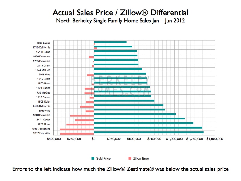
How accurate is your home’s Zillow Zestimate® of Value?
Recent sales demonstrate that the Zillow Zestimate® estimate of value is very good ... at being incorrect!
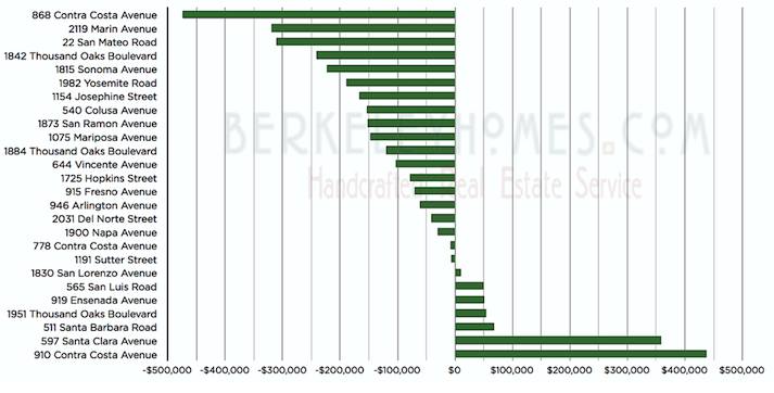
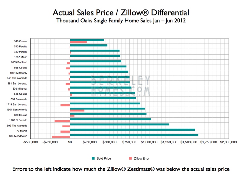
Two homes on Contra Costa in Thousand Oaks closed within 46 days of each other. 868 Contra Costa sold for $473,826 more than the $1,167,034 Zestimate®, 910 Contra Costa, only 5 doors away, sold for $437,681 less than the $1,102,681 Zestimate®. The Zestimates® were only about $64,000 apart; the sales prices differed by over $900,000! Thus, the answer to the $64,000 question “How accurate is Zillow?” ... not very accurate at all!
Here’s how the Zestimate® compared to actual sales prices – over half of them were off by more than $100,000.
Call us at 510-526-6668 when you’re ready to find out what your home’s really worth in todays’ market!
Would you like a real estate market report customized for your home? Email serkes@berkeleyhomes.com and I'll prepare one for you!
Amount Zestimate® Differed From Actual Value
Difference between Zestimate® and Sales Price
Would you like a real estate market report customized for your home? Email serkes@berkeleyhomes.com and I'll prepare one for you!
One of the most important components of our seller and buyer representation is to provide our clients with the research and analysis they need to make informed decisions.
My data comes from the East Bay Regional Multiple Listing Service (MLS). It shows all homes sold through the Berkeley MLS (and doesn't include every home sale such as private sales), but I feel that it represents a significant sampling of home sales in the area. I download the information from the MLS, then import it into several File Maker Pro databases. Once in the databases, I can easily slice and dice it.
I use Cloud CMA to download the Zillow® Zestimate® data from Zillow® Online Real Estate Marketplace
Maps and graphs are particularly effective in trends and patterns, so thought you'd be interested in these.
Want to know where homes are in your price range?
What homes are selling for in your neighborhood?
Where Berkeley's largest homes are?
Where you're most likely to find homes with bedrooms you need?
I've created a series of interactive maps for homes which closed escrow in Berkeley and nearby communities. The most recent research and analysis is at the top; scroll down to see previous reports.
Been waiting to sell? Want to be closer to family? Moving to a new job? Need a larger home ... or perhaps downsizing?
Now’s the time you’ve been waiting for. Home prices are up ... and we know how to find highly qualified and motivated buyers for your home. 38% of our 2012 sales (including one for $1,360,000) were all cash! Put our deep local market knowledge, local expertise, superb marketing and tested negotiation skills to work for you!
Call us at 510-526-6668 (direct) or 510-684-3334 (cell) or email serkes@berkeleyhomes.com -
let's meet.
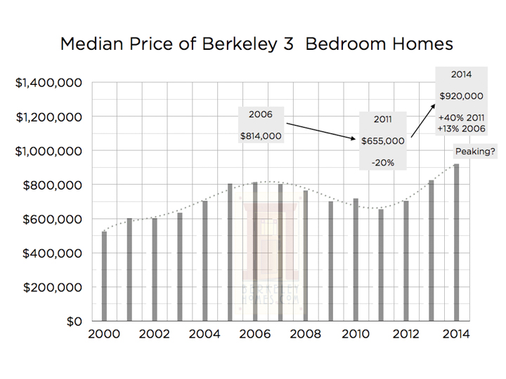
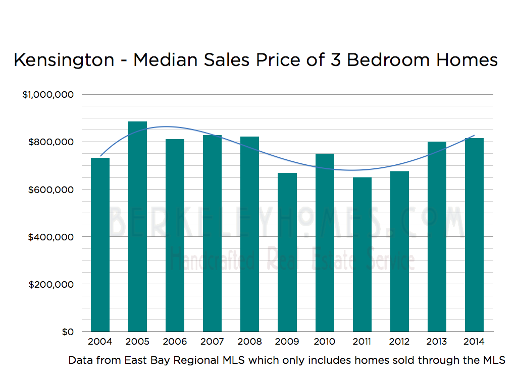
Kensington Median 3 Bedroom Home Prices - 2004 through August 2014
Most of the Kensington homes sold in the Multiple Listings Service (MLS) are 3 bedrooms, so analyzed median (half sell for less, half for more) sales price trends over the past 10 years. The 2014 numbers are year-to-date; all other values are for the entire year. The green bars are the median 3 bedroom sales price by year; the blue line is a polynomial fit of the data.
Prices climbed dramatically from 2012 to 2013 - we saw the same trend in Berkeley.
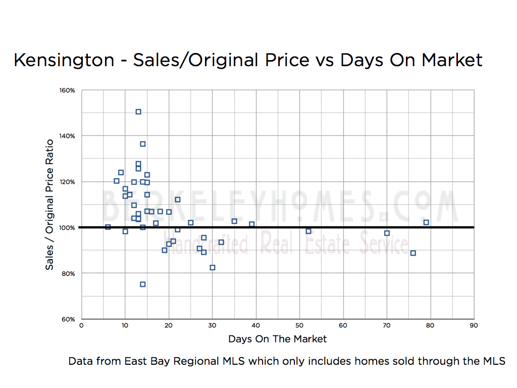
This graph shows the ratio of the sales price to the original list price as a function of days on the market; Berkeley real estate sales show a similar pattern.
Most of the homes sell between 10 and 15 days on the market; that's the result of reviewing offers after 1 or 2 open houses. Most homes sell within 21 days on the market and generally sell for over (often a lot over) the asking price.
For the first few weeks a home's on the market, uncertainty favors the seller - buyer's base their offer upon how many other buyers are bidding on the home.
Once a home's been on the market 3 or 4 weeks, the uncertainty favors the buyer. They feel that if the home's not sold, it may be overpriced. Thus homes which sell after this period tend to sell for less than the original price.
We've found that the best strategy for sellers is to price the home at the lower range of the likely price, and let our marketing work to get multiple offers and overbids.
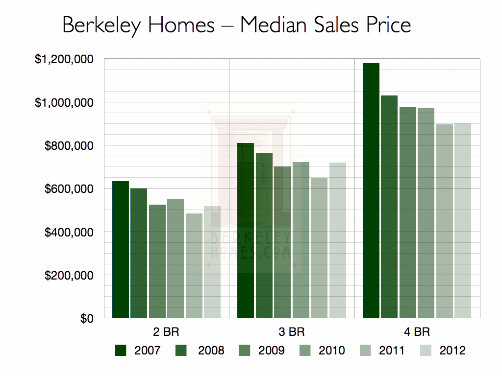
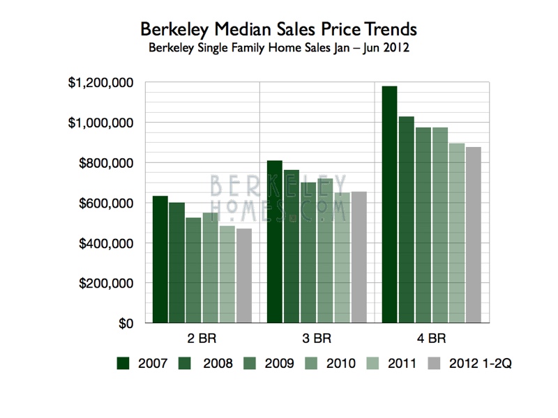
2012 Berkeley Sales Price Research
The Berkeley real estate market is robust and home prices are rising again.
This graphs the median home price (half sold for more, half for less) over the past 6 years. About a year ago the data indicated that prices would stabilize and perhaps rise in 2012 ... And that’s what happened.
With strong buyer demand, low interest rates and very low inventory, 2013 is off a robust start - many homes receiving multiple offers and selling for significantly above asking price.
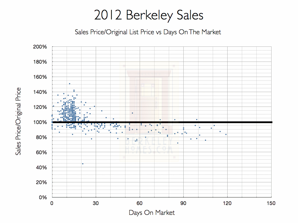
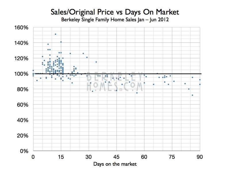
This shows the sales price/original list price ratio for Berkeley homes. The ratio is plotted against days on the market ... the day that seller and buyer came to agreement.
The cluster of sales shows that properly priced homes sell quickly and most for for more than the asking price.
In 2012, 64% of Berkeley purchase agreements were ratified within 16 days of coming on the market, and 88% of those houses sold for asking price or more.
Why 16 days?
Homes typically come on the market early in the week and have a Thursday real estate broker tour and one or two Sunday Open Houses. The seller reviews offers the following week and comes to agreement with a buyer within a day after offers ... And that’s within 16 days from coming on the market.
The cluster of sales above the 100% line indicates multiple offers - Buyers bid up the price of a home when they're competing against other buyers for the house.
We have a 30 day “price tipping point”
Once a house has been listed for 30 days or more, and hasn't yet sold, buyers know that the list price is probably too high. 88% of those homes sold for less than the original asking price. They likely sold for lower prices than they would have if the seller had priced them correctly in the first place. Sellers are in a stronger position when they have several buyers vying for their home; after 30 days they usually only have one buyer to negotiate with.
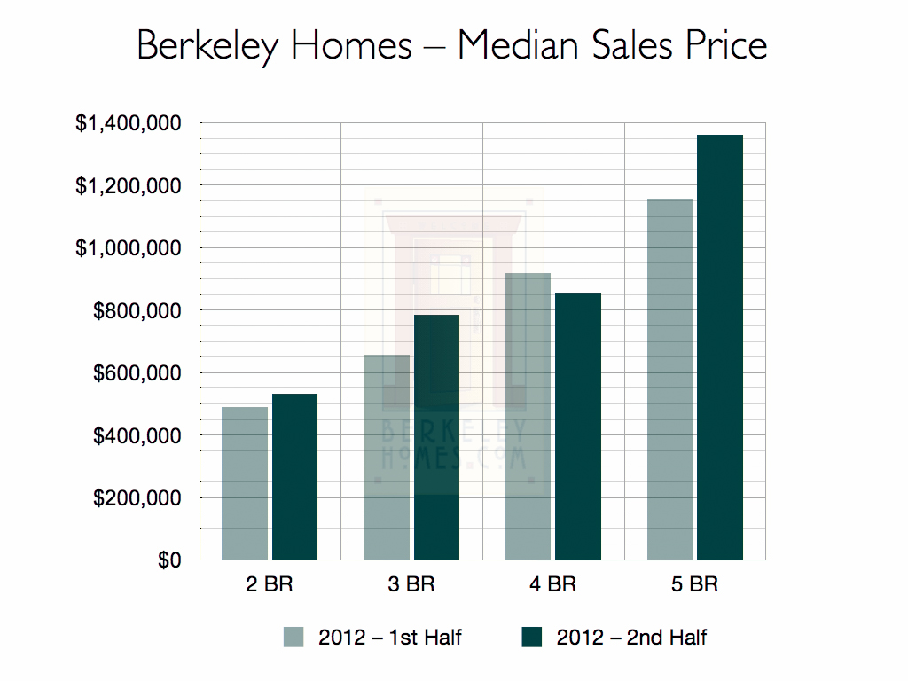
2012 felt like two different markets - the 1st half of the year prices were stabilizing, the 2nd half of the year prices started rising.
I was curious why the 4 bedroom median price dropped, so studied them in depth. The asking price of 4 bedroom homes were lower in the 2nd half of the year; that could be why the median price was also lower.
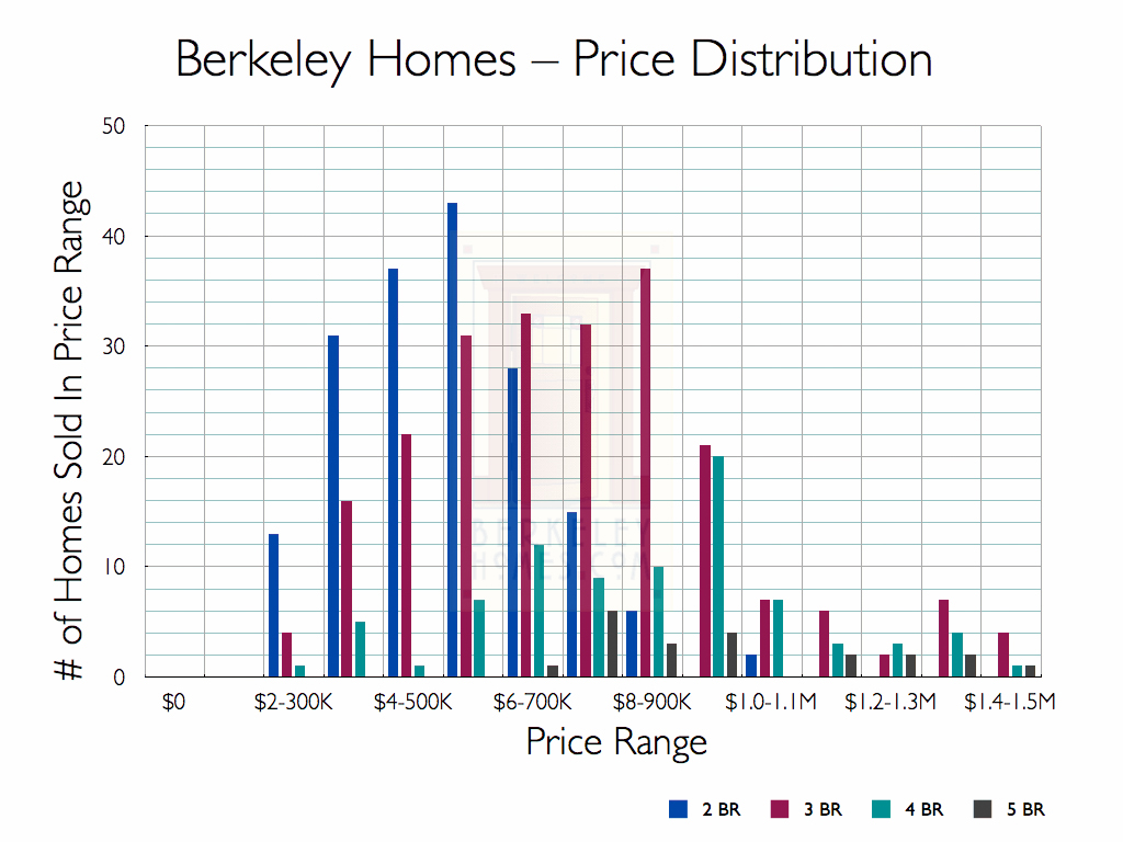
Here’s how the the sales were distributed for 2 to 5 bedroom homes in $100K price increments. 95% of the homes sold for $1.5M or less; I’ll do another report to discuss Berkeley’s fine and luxury homes.
Much of Berkeley was built up by the 1930s, so the homes tend to be smaller - 73% of the single family homes which sold in 2012 were 2 or 3 bedrooms; only 8% of the homes has 5 or more bedrooms.
Much of Berkeley was built up by the last 1920's, so our homes tend to be smaller than in communities which were built up in the past 20-30 years.
The median square footage of Berkeley single family homes is about 1,500 sq ft.
The larger homes tend to be in the Elmwood/Claremont neighborhood and the Berkeley Hills, or were rebuilt in the Claremont Hills after the fire.
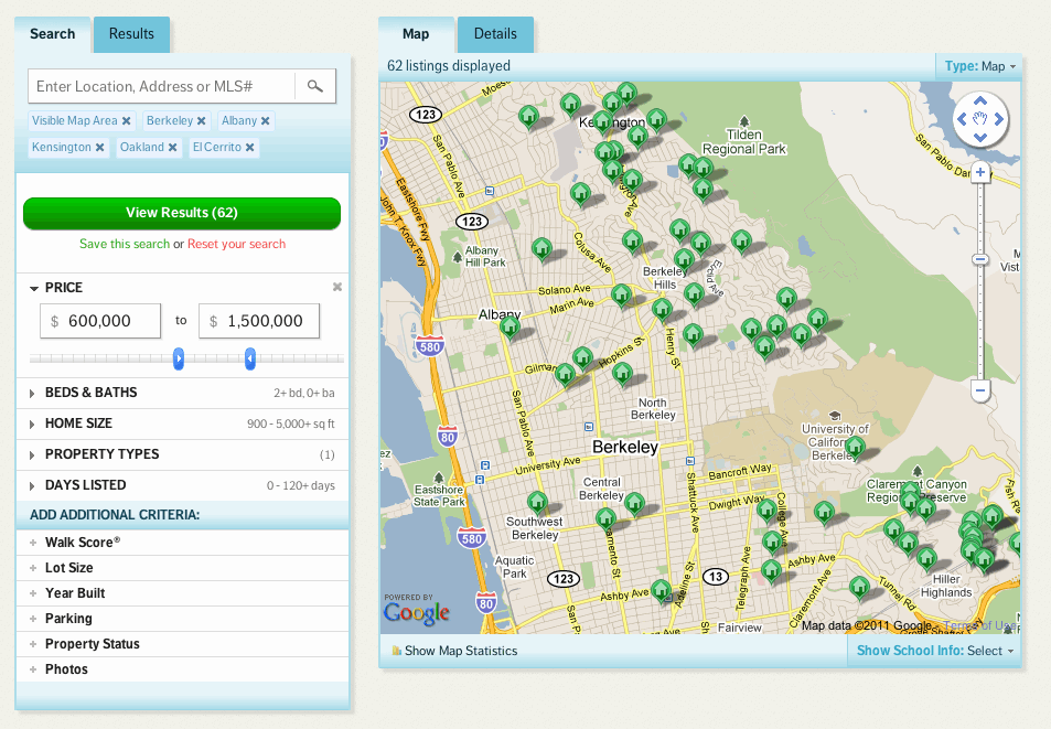
Maps – A Great Way to Visualize The Berkeley Real Estate Market
Here are interactive maps so you can see what the 2012 Berkeley Real Estate Market was like!
Zoom in to search by neighborhoods, filter the maps by clicking on the pushpins (bedrooms, price range, square footage, etc.) at the bottom of each map, click on the home's map marker for details.
If you want to "reset" the filter, just click on the description to the left of the pushpins.
Ira
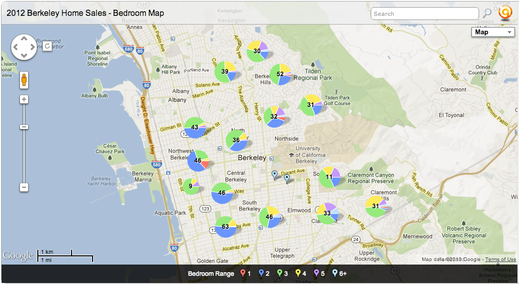
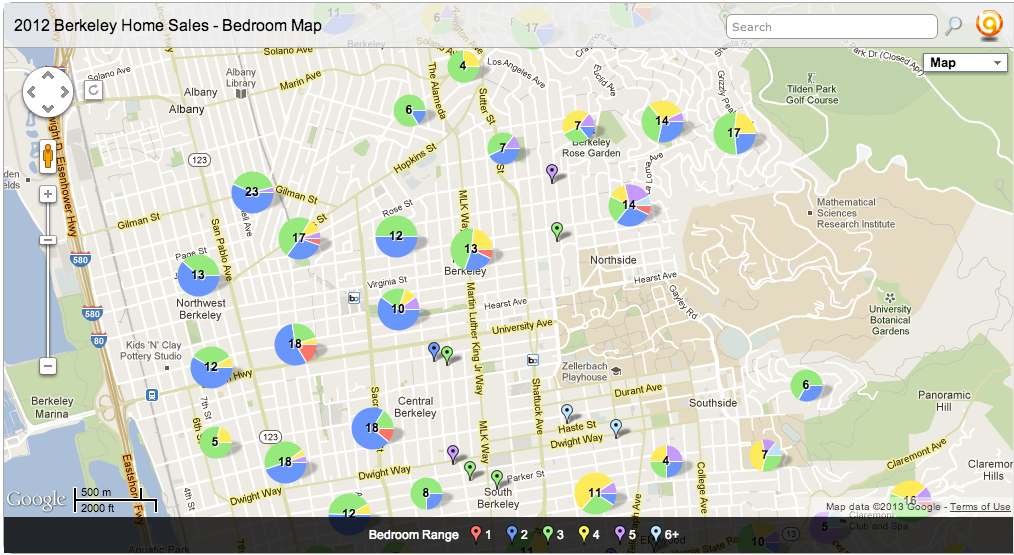
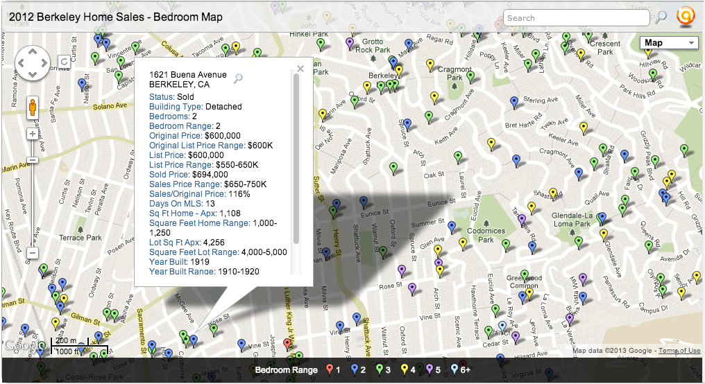
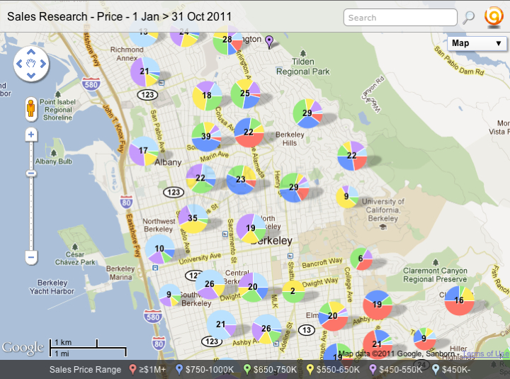
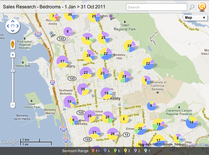
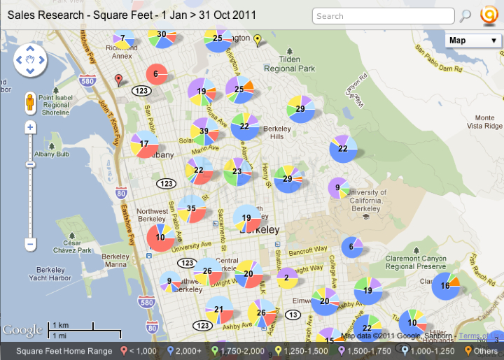
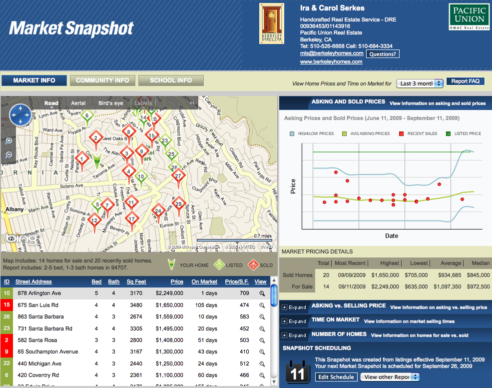
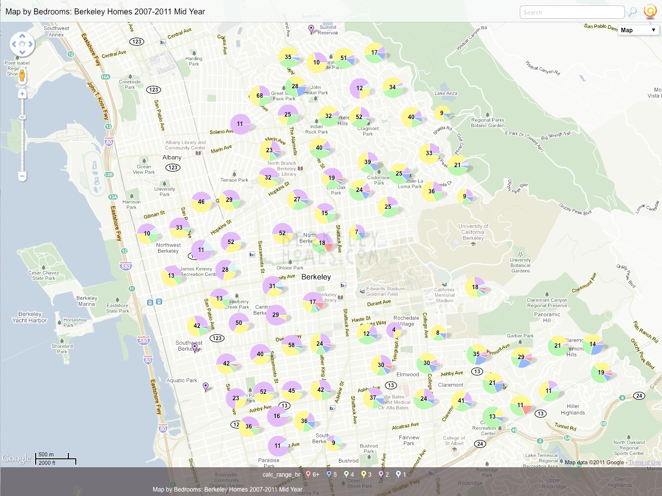
The following three images are screen shots to show how you can zoom from the overview pie chart > neighborhood > street level ... just click on a push pin to view details.
These are the interactive maps - click and drag to move around; use the +/- to zoom in and out
2012 Berkeley Single Family Home Sales - Organized by Sales Price
Berkeley Single Family Home Sales – 1 Jan through 30 Jun 2012
What's Sold? Here are interactive maps for you! Zoom in or out to search by neighborhoods, filter the maps by the pushpins at the bottom of each map, click on the map marker for details!
Click to the left of the bottom pushpins to "reset" the filter and show all the data.
Ira
Select the colored map marker at the bottom to filter by sales price range.
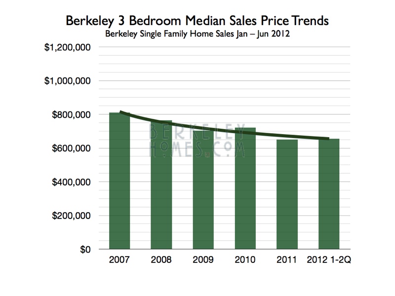
I use the median price (half the homes sold for more, half for less) as my indicator of the market. It felt like the first 6 months of 2012 had large price increases; what really happened is that the prices seem to have stabilized.
We've seen 4-5%/year price drops for the past several years. One way to look at it is that if the prices have stabilized, it has the same effect as a 4-5% increase in price.
The trend of 3 bedroom median prices bears this out. When I did this graph at the end of 2011, it indicated that home prices seem to have stabilized. The trend line shows that we're bottoming out (or, for the mathematically inclined, we're hitting a relative minimum with a derivative = 0)
What's the market like? Robust! Many buyers making offers on few listings.
Each data point reflects a closed transaction. There are several at 0 days on the market, these are generally homes which sold "off market" and were put into the Multiple Listing Service (MLS) as comparable sales (sales comps).
The majority of home sell within 7-16 days. Nothing magical about those days-on-the-market; they simply reflect the fact that most sellers don't look at offers until after the 1st or 2nd Sunday Open House.
Most of the homes which sell within 16 days sell for more than the asking price. That means that there were multiple offers on the home, since buyers bid more than the asking price when they're competing against other buyers for the home. Some homes which sold for less than asking price during the 7-16 day period - those may be homes where the buyers offered above asking, and then negotiated the price down after inspections.
The Uncertainty Tipping Point - 28 Days
When a home first comes on the market, the uncertainty favors the seller. Buyers aren't sure about what the home's worth, so if they're competing with other buyers, they'll bid the price up.
Once a home's been on the market at the same price for 28 days, the uncertainty
favors the buyer. The buyer might not know what the home's worth, but since no one has bought it at the listing price, they know what the home's not worth.
Almost all the homes which sold after 28 days on the market sold for less than the original asking price.
There are several ways to look at this:
1: The original asking price was too high
2: The seller sold for less than they could have if they'd priced their home properly to begin with
I think both answer are correct. Point 1 is obvious, Point 2 less so.
When a home sells after 28 days, the seller is likely working with only one buyer ... and the buyer knows that so has a higher probability of receiving seller concessions in the form of price or credits. A more subtle reason is that if the seller has 2 or more offers, they have a stronger hand in negotiating with the accepted offer.
The executive summary - sellers who price their homes at the lower end of the price spectrum, and wait to receive offers, generally receive multiple offers and overbids.
Correlations
We've found no correlation between how many people attend an open house and what the home sells for.
There is a strong correlation between how many buyers ask to review a disclosure package and how many offers are written on the home.
There is also a strong correlation between how many buyers write an offer, and what the home sells for.
We share that research with our buyer clients when we're discussing what kind of an offer to make.
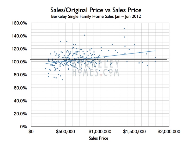
I was curious if higher price homes ended up with larger overbids.
This graph indicates that's the case. Buyers with more money are willing to pay more for a home they want. The Apple Numbers program calculated the linear trend line.
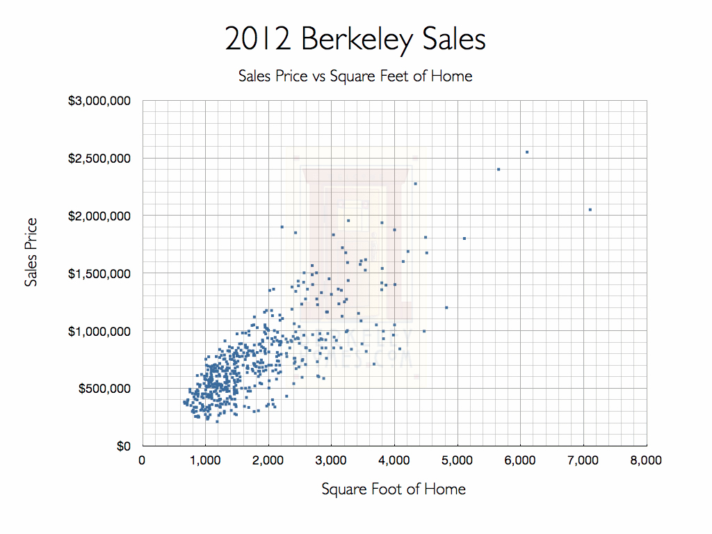
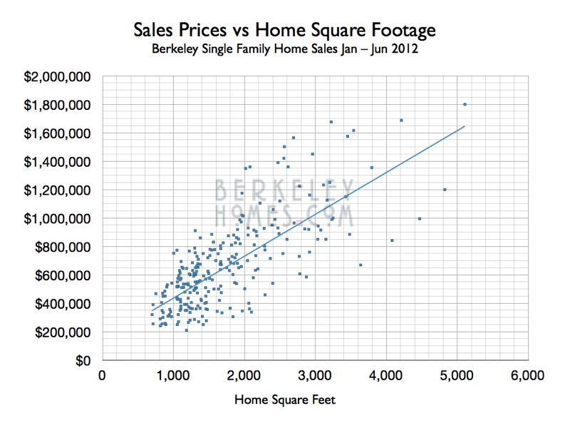
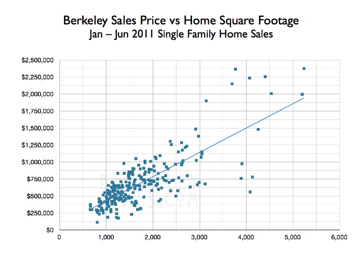
There's also a strong correlation between the size of the home in square feet, and what it sells for.
Buyers who relocation from other parts of world use $/ft² or $/m² as a pricing indicator.
Berkeley has a diverse housing stock, and though we have different neighborhoods, we don't have tract developments.
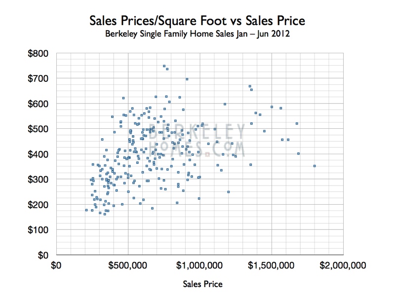
$/ft² has too much scatter to be useful when determining value.
The Zillow® Zestimate® says it's worth ....
Our clients often tell us that the Zillow® Zestimate® for this home is ....
So I set out to see how the Zillow® Zestimate® compared to market value.
The easiest way was research actual home sales prices, and see how the Zillow® Zestimate® price compared to it.
Not well .. but you already knew that.
Zillow® has algorithms ... we have boots on the ground.
Here's the analysis...
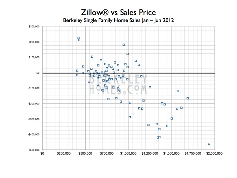
This graph shows how the Zillow® Zestimate® compared to the actual sales prices. The data is from 4 different Berkeley Neighborhoods - Thousand Oaks, Berkeley Hills, North Berkeley & Elmwood Claremont. The neighborhood charts are shown in the next section.
The vertical axis indicates the difference between the Zillow® Zestimate® and the actual sales prices. Any data point above the dark line indicates that the Zillow® Zestimate® was higher than the home's market value. Those below the dark line are when the Zillow® Zestimate® was lower than the home's market value.
Most of the time the Zillow® Zestimate® is below the home's market value.
How much was the Zillow® Zestimate® off? $50,000; $100,000; $200,000 or even $400,000 or more!
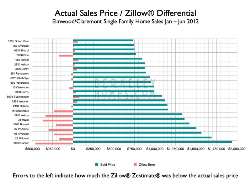
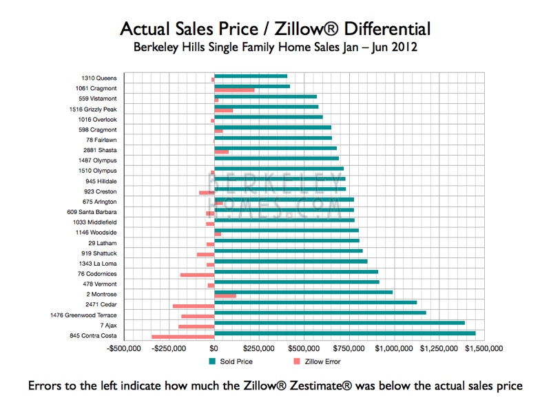
The red bar shows how much the Zillow® Zestimate® differed from the actual sales prices. When the bar is to the left of $0, the Zillow® Zestimate® was less than market vaue; when it's to the right of $0, it's higher than the value.
Selling or buying? Ready to put our expertise to work for you?
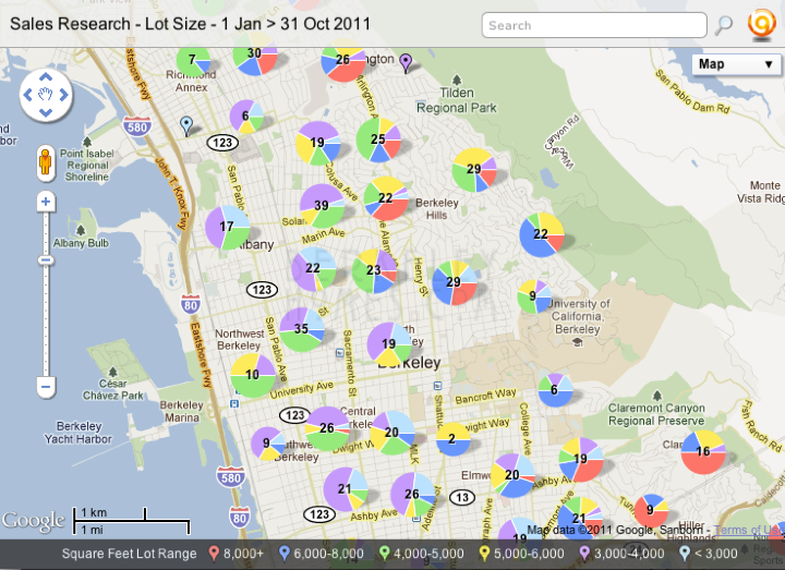
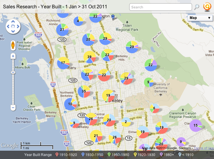
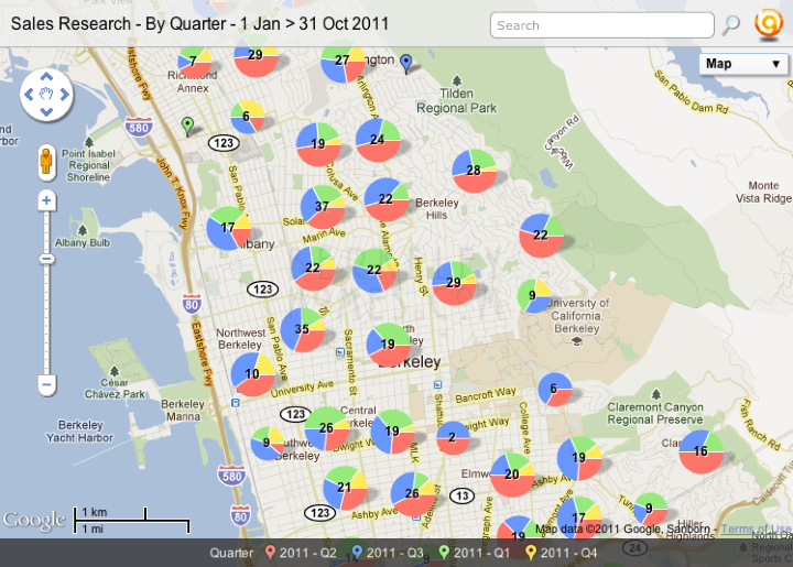
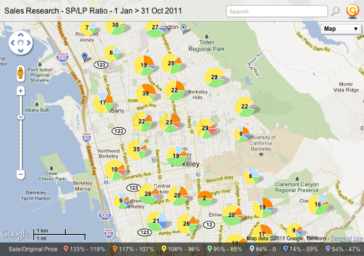
Berkeley, Albany, Kensington, Rockridge, Montclair, Piedmont & El Cerrito Home Sales Research
Homes sold 1 Jan - 31 Oct 2011
Click on the map image and you can zoom in and around your favorite neighborhoods .. and find out what's happening near your home. The report has 7 different maps:
Sales Price
Bedrooms
Square Feet of home
Square Feet of lot
Year Built
Sales by Quarter
Sales Price/Original List Price ratio
Within each map you can filter by variables such as price range, home size (bedroom or square feet) or year built.
Interested in details of the houses which have sold? Just click on the pushpin and you can find details such as the sales price, how it compared to the original price, bedrooms, square feet, when built, lot size .. and more!
Here's a video I created to show all the cool things you can do with the maps
Would you like to search for homes ... or receive updates of activity near your home?
It's our pleasure to provide that information to you ... just click on each of the following maps to subscribe to our updates!
Searching for a home? Want to see what's new on the market? Click this map to subscribe to email alerts.
Want more detailed market research? Use the above form to subscribe and we'll send you reports like these ...
The maps, charts and reports below are from our research archives
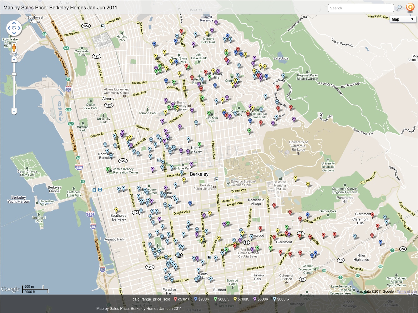
These maps show the Jan – Jun 2011 Single Family Home Sale in Berkeley!
Berkeley Single Family Home Sales – Jan through Jun 2011 – Organized by Sales Price
Berkeley Single Family Home Sales – Jan through Jun 2011 – Organized by Number of Bedrooms
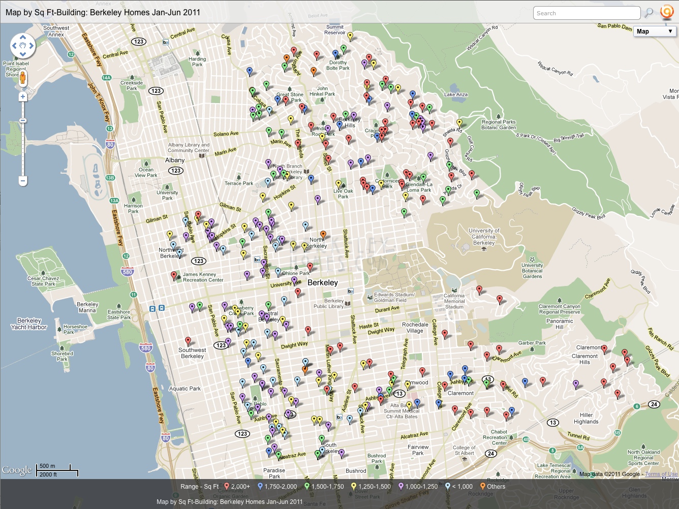
Berkeley Single Family Home Sales – Jan through Jun 2011 – Organized by Home Size in Square Feet
Berkeley Single Family Home Sales – Jan through Jun 2011 – Organized by Lot Size in Square Feet
What's the market like? Yes ... we're still seeing multiple offers and overbids!
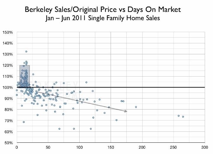
Sales Price/Original List Price ratio as a function of days on the market
Each data point in this scatter chart represents a sale. The dark horizontal line is at the 100% mark - homes which sell at the asking price.
Any data point over the dark line represents an overbid - the home sold for more than the asking price. The gray box shows that we still have a robust market - most of the homes which sell within 3 weeks sold for above the list price.
What about homes which linger on the market? Once a house has been on the market for over 30 days, when it does sell, it usually sells for less than the asking price.
Does this mean that the buyer got a bargain? Possibly. They likely purchased the home at market value, but since they didn't have to compete with other buyers, they had a stronger position when negotiating price and terms.
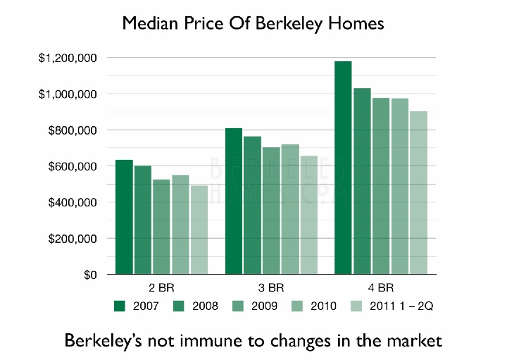
Now to tell the rest of the story - how have prices changed over the years? The following graph shows that the median home price has dropped since 2007.
I use the median price to compare one year to the next. The median price is simply the price at which half the homes sold for more, and half sold for less.
The average price is skewed upwards because the most expensive 5-10% of the homes for each bedroom count sell for significanly higher prices than the rest of the homes with the same number of bedrooms.
This graph shows that the median price of Berkeley single family homes stabilized in 2009-2010, and has decreased in the first half of 2011 compared to the value in 2010.
Will be interesting to see what 3rd Quarter 2011 brings.
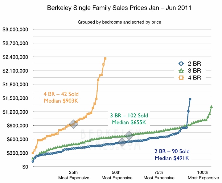
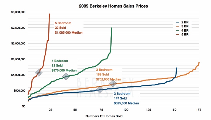
This graph shows how the home prices were distributed for each bedroom count.
I sort the sales prices for 2, 3, and 4 bedroom homes, then use a simple line chart to show how the prices increase from the lowest sales price to the highest sales price. This shows why I prefer to use the median price rather than the average price - the homes which sold in the top 5-10% of each bedroom count sell for significantly more than the others.
Several things to note:
1:
The number of sales for the 1st & 2nd quarter of 2011 is significantly more than 50% of the number of sales for 2009. Keep in mind that sales are not uniformly distributed throughout the year ... August and December are two of our slowest months. When I have time, I'll compare 2009 1st & 2nd Quarter to 2011's.
2: Median price for 2, 3 & 4 bedroom homes are lower than they were in 2009.
2009
2011
$ Difference
% (2 years)
%/year
2
$525,000
$491,000
$34,000
6.5%
3.2%
3
$702,000
$655,000
$47,000
6.7%
3.3%
4
$975,000
$903,000
$72,000
7.4%
3.7%
This comparison is a bit of "apples and oranges" ... I'm comparing 6 months of data in 2011 with an entire year of data for 2009 ... but I think this shows that while Berkeley is not immune from what's happening in the United States real estate market, the effect on home prices is tempered at 3-4% decrease in the median price over the past two year.
You're probably wondering ... why are the 4 bedrooms homes so much more expensive than 3 bedorom homes? Well, they're larger ... but does that account for all the price difference? Let's look at the sales price as a function of square footage of the home.
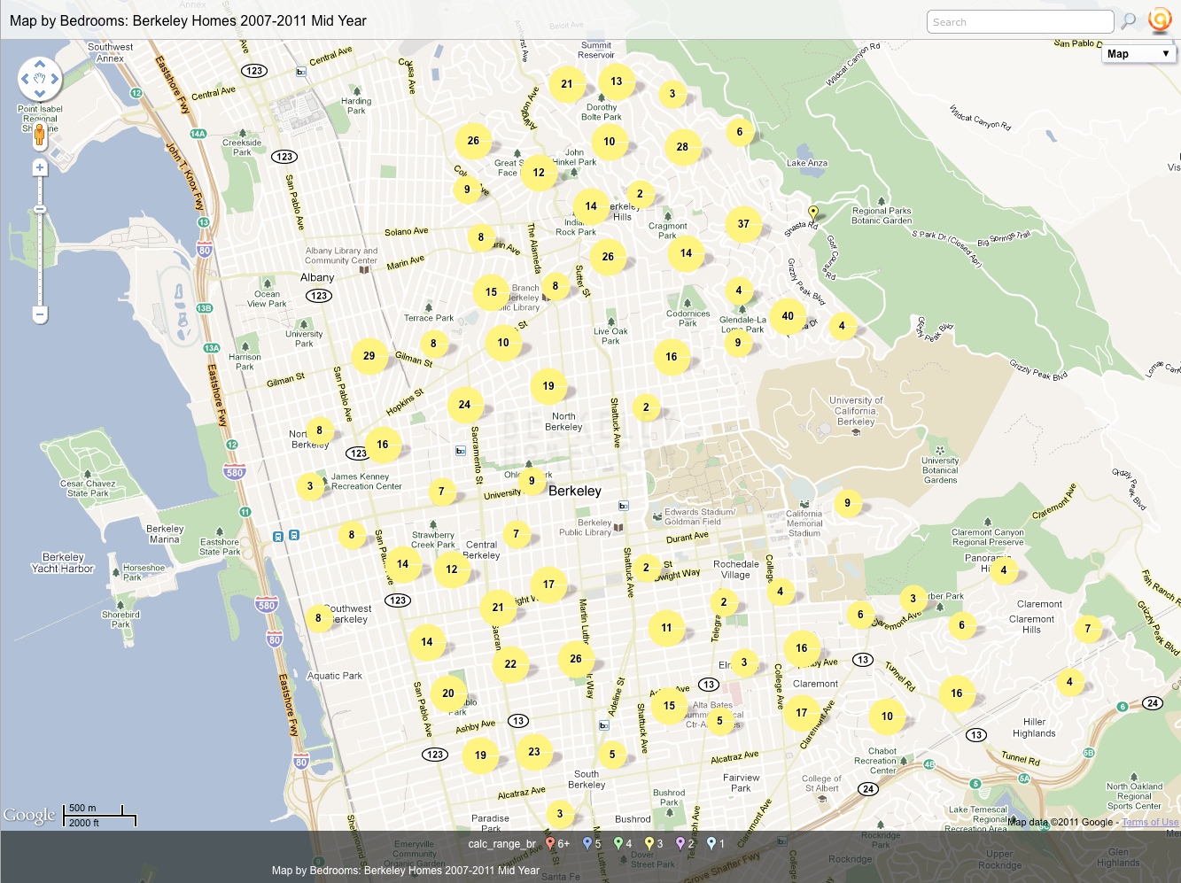
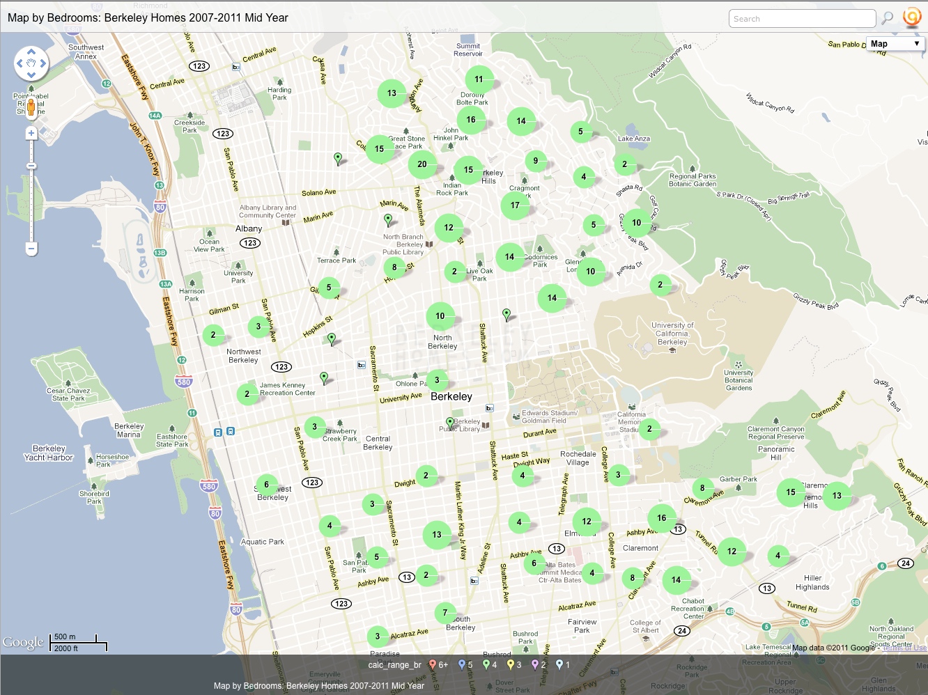
Multi - year overview - This shows which Berkeley neighborhoods are most likely to have the features (bedrooms, home size, lot size .... and even year built) you're looking for!
This data spans 2007 to 2011 Mid Year, so doesn't including sales price.
Sales price definitely increase as the homes get larger ... but 4 bedroom homes aren't that much larger than 3 bedroom homes. What else could be making the difference?
Aha ... it's Location Location Location! The 4 bedroom homes are concentrated in Elmwood, Claremont, and the lower Berkeley Hills!
3 bedroom homes are distributed all over Berkeley
4 bedroom homes are clustered in Elmwood, Claremont and lower Berkeley Hills - more expensive neighborhoods!
And now for some more interesting maps ... and you can explore them by simply clicking on each map!
Carol told my cousing Mimi that there's nothing I love more than being in a new city in another country with my photographer's vest filled with maps and guidebook.
I'm particularly interested in Art Deco Architecture, so whereve we travel, I create databases with the addresses of interesting places, and then map them. Here's a map I created for Washington DC, Baltimore & Philadelphia; another for Los Angeles.
I knew I could use the same technology to give a sense of what the Berkeley Real Estate Market is like. These maps are created using data from 2007 through Jun 2011. Once again, it comes from the East Bay Regional/Berkeley MLS and doesn't include all home sales. I also didn't filter it for duplication (many homes have been sold more than once in that time frame) ... but since it represents over 2,000 sales, I thought it gave a good representative sampling.
Note that this series spans 2007 through Jun 2011, so I didn't create a price map.
Map of bedroom distribution by neighborhood
Homes with 4 or more bedrooms are in Elmwood/Claremont, upper Claremont, or the Berkeley Hills.
Most of the homes sold in Berkeley are 2 or 3 bedrooms - that makes up most of Central and West Berkeley.
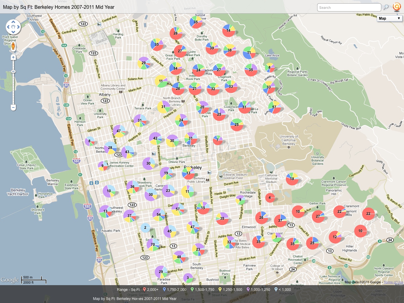
How large are the homes?
The largest square footage homes are also in Elmwood/Claremont, upper Claremont, or the Berkeley Hills. Not rocket science - larger homes have more bedrooms!
About 1/4 of the homes in Central and West Berkeley are less than 1,000 sq ft (that's small for a 2 bedroom home).
1,500 to 1,750 square foot homes are concentrated in the lower Berkeley Hills.
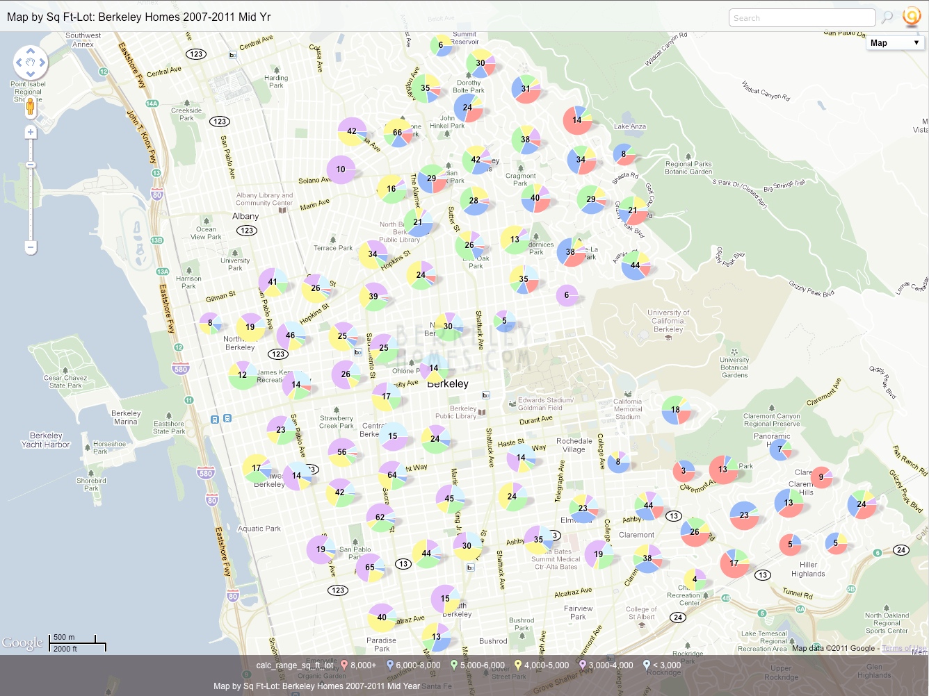
How large are the lots?
The median lot size is about 5,000 sq ft. The larger lots are (drum roll) in Claremont, Upper Claremont, and the Berkeley Hills
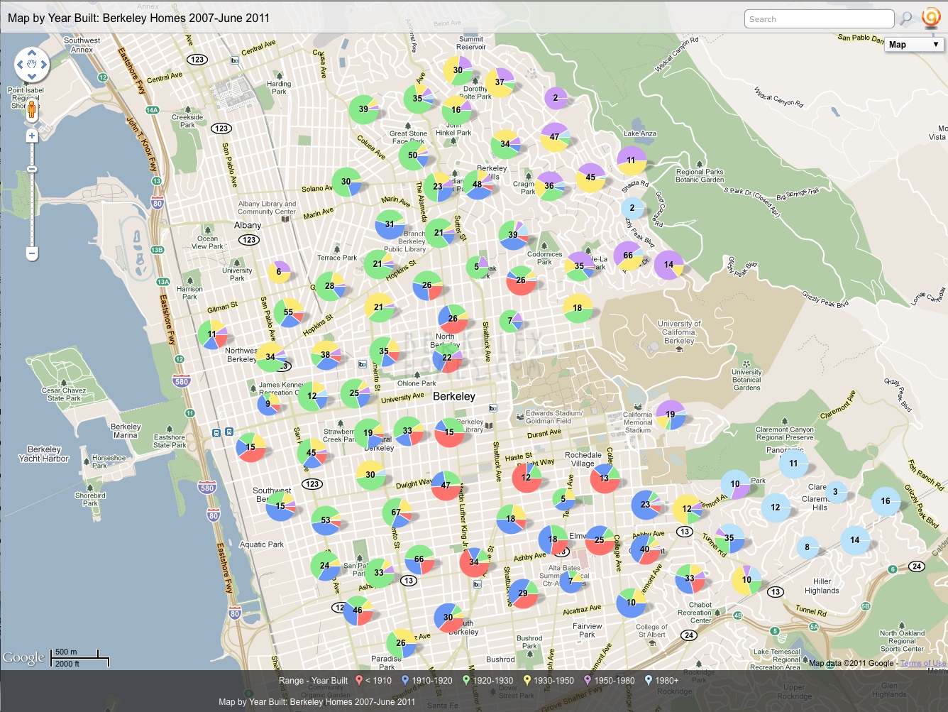
The firestorm is why there's a grouping of blue circles on the bottom right ... all these homes were built after 1990.
Elmwood and South Berkeley has the highest concentration of homes built before 1910.
Our Thousand Oaks neighborhood is almost a sea of green circle surrounding Great Stone Face Park at the top of the map. Whenever we show homes in the neighborhood and the buyers ask "when was this home built" I usually say "In the 20's". This really makes it apparent.
The Berkeley Hills above Spruce was primarily built up in the 1930's- 1980's. What was also interesting was how many homes in North Berkeley and Northbrae were built around that time.
Connect with us online!
Photography
CA Bureau of Real Estate License Numbers – Ira Serkes 00936453 Carol Serkes 01143916